


New logo represents broader role for National Art Centre in Ottawa
Last Tuesday Ottawa’s National Arts Center announced a logo make-over, the first such change since the Centre opened in 1969 – Canada’s centennial.
Maybe that announcement strikes some as too boring for words! But I’ve nattered on the topic of design (good and bad) in previous posts, so what’s another stab at that topic?

Logos for the National Arts Centre: the old (above) and the new. Images: NAC
The old logo (credited to Rolf Harder) featured orthogonal lines that referenced the shape of the main building, which was designed by Polish-Canadian architect Fred Lebensold. The newly-debuted design is the result of nine months of work by the Toronto firm of Scott Thornley + Company, at a reported cost of $90,000. (From the Globe and Mail):
The new one, a sleek, solid rectangle evocative of the span of the Canadian flag, the N bisected by a negative space reminiscent of a spotlight’s conical shaft, reflects “the changing face” of the NAC, says long-time president/CEO Peter Herrndorf.
“It’s become focused more and more on being a national organization working with artists and arts organizations in every part of the country. It isn’t just a building; more than anything else the NAC is a kind of galvanizing idea about creating a national stage for Canada.”
Peter Robb of the Ottawa Citizen spoke with Scot Thornley:
Along with the new symbol comes a new slogan “Canada Is Our Stage.” Together they put an emphasis on the centre’s national mandate and its determination to play a leading role in Canadian cultural achievement.
The rebranding exercise is meant to underline in communities across the country that the NAC is not just a building in Ottawa, managing a performance centre — it is also helping to stimulate creative activities across the country, Thornley said. And to help sell the NAC abroad as Canada’s cultural centre, he added.
The announcement by the NAC Tuesday is also a kick-off toward the 50th anniversary of the institution on June 2, 2019. The centre is calling the five years prior the Road to 2019 a journey that will include a series of significant events and milestones leading up to its 50th anniversary.
This video interview with Herrndorf explores the reasoning for the change, how a building-centric logo failed to express a larger mission that extends beyond one set of walls – or one capital city. And this zippy video promo takes a whirlwind look at the NAC’s diverse offerings.
Side note: the NAC’s Facebook page has retroactively replaced the old logo with the new one. Maybe that’s standard practice but I can’t say I agree with it. Seems to me items should appear as the did, when they did, under the logo of the time.
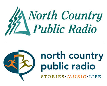
NCPR logos: old (above) and new.
So, change doesn’t always go down smoothly, but what do you think? Good? Bad? Indifferent?
Of course, NCPR did a logo revision a few years ago, feeling slightly lost in the vast forest of organizations and companies that used trees as their symbol. It was decided “stories, music, life” more aptly summed up the station’s purpose and pleasures. And here I will confess that I disliked the new branding – at first. I thought the motto was too cute (verging on pretentious??) and the logo was too busy. (What was it, exactly?!)
Well, time has passed and both grew on me. I’ve decided they work and say what needed to be said in a good way.
What about you? How would you rate the old NAC logo to the new one, or the old NCPR tree image to the icon that replaced it?
Tags: architecture, arts, canada, culture, design, music, National Arts Centre, ncpr, tourism


I liked the old NCPR logo. It evoked place. In our increasingly homogenized times, anything that evokes a sense of place is rare and valuable.