Designing good design
Canada has one of those major anniversaries coming in in 2017. The nation will be 150 years old – or young, or however you frame that. 2017 may still seem a tad distant, but major event planning requires lead time.
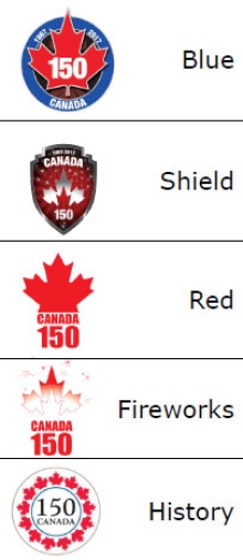
Of course, these days such things demand branding and logos. So the hunt for a good symbol has been underway for a while. Here are five designs trotted out by the federal government for public reaction late last year.
The trouble is, initial submissions have (shall we say?) failed to impress. Alternative logos are pouring in, and they do feel more creative. Check them out at something called The150Logo.ca. That site was set up by a Canadian, Ibraheem Youssef, who works as a graphic designer in Boston, after he just couldn’t swallow the initial proposals.
Indeed, the logo debate has become lively, even international, as seen in this discussion piece by the UK’s Creative Review.
Meanwhile, the Toronto Star has a recent development, coming out of the private sector. Environics Communications is proposing a $25,000 prize to spur more designs and (hopefully) kick things up a notch. As mentioned in the Star article:
In the government’s focus group testing last year, participants compared early drafts of Canada’s birthday logo to a hockey puck, a police shield and a lace doily.
A Dec 20th Environics Communications blog post by Jonathan Litwack on the topic includes a bunch of discussion and data about the topic. It’s a fun peek into how marking works, including how to identify potential problems as measured by word cloud responses:
…. the keywords are fairly generic, but with on the outskirts of the story’s key elements like “Logo”, “anniversary” and “150th” we can see that there are some very interesting words like “sorry”, “wow”, “mixed”, “sad” and “c’mon”.
Each one of these “negative” keywords gives us a good sense of the initial reaction to the news.
It appears coming up with a more exciting design is becoming a point of pride of sorts.
As of this writing, I’m unaware of any government response to the offer of prize money, or if any such contest would be open to non-Canadians. (An interesting quandary: should the goal be the best design from anywhere, or the best design generated by national talent?)
Good design is a quirky thing – sort of like Supreme Court Justice Potter Stewart’s long-famous quip about pornography. Somethings are difficult to formally define, but “I know it when I see it.” (Trivia bonus: that particular line, apparently, may have come from his law clerk.)
A secondary layer to the debate touches on who gets to produce what? Is design something best left to professionals? Or does creativity reside everywhere and anywhere? Here’s a comment about the Canada 150 logo issue from the afore-mentioned UK Creative Review article:
Everyone is talking about what constitutes good design, so design is the big winner here (and Canada – eventually). And in many ways both sides are correct – apart from the clumsy comparison to ‘crowd sourcing’. Sometimes a great mark will arise out of a narrative that evolves from extensive research, and sometimes the solution is a moment of aesthetic inspiration. Indeed, good design is about more than aesthetics, but then again sometimes it really isn’t. We just need to be honest about that, and get the context right. I vividly remember the initial furore over here in London, following our ‘2012’ Olympic logo. Not one person on the street could tell you what the logo was supposed to represent, they just liked it or didn’t. In the end the whole country seemed to embrace it, based on the positive context in which it was framed.
There are no hard and fast rules in creativity, more a collective of subjective views based on context and influence. In essence it seems like this is a logo for the community, as opposed to creative directors and font designers, so an open mind to what ‘good’ design represents in this case, is probably welcome. But these discussions are ultimately good for the creative industries, good for businesses, and good for the societies we serve.
I’m not even Canadian, but I might move as at least there’s a bit of excitement going on over there.
Greg Bunbury
Or, as Jonathan Litwack’s post ended:
This conversation seems to be far from over, but we’re hoping that the key decision makers in this project take notice of the attitudes of Canadians towards these fantastic crowdsourced logos and opens their selection up to these ambitious and patriotic designers.
Can anyone define good design? Or is it more like minor magic?
Perhaps creativity and beauty are just qualities we recognize when we see them.
Tags: 150th, art, canada, design, Ibraheem Youssef, logos, marketing


