Ballot design

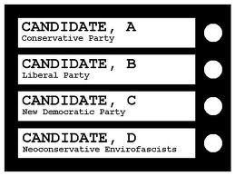
Canadian ballot sample: each race is on its own page, and the voter can mark only one candidate per race. The beauty of simplicity.
I thought it was me. All these years I’ve been voting, I’ve thought something was wrong with me because I have always found the NYS ballot hard to figure out…and I vote every year. I have to stop, look at the ballot carefully, make sure I’m checking the box I really mean to check, and then I worry that somehow I’ve voted for two candidates in the same race.
Vindicated! That’s how I feel after today’s piece in the NY Times. Mo Rocca, who many of you may know as a regular panelist on “Wait, Wait Don’t Tell Me,” is featured in the video with a designer who critiques a number of states’ ballots…including NEW YORK. Yeah!
Before you vote tomorrow, do watch this video. And, then, remember to take your time with your ballot because the user-friendly redesign has yet to be implemented in most states. Canada, on the other hand, has a ballot that, well, even I can understand.
Tags: ballots, Canadian elections, voting


Just to point out one more thing. In the Canadian system the voter can not mark only one candidate per race. There is only one race per vote. The downside of what we do is the rest is all appointments based on the one vote for your local member of the legislative assembly. The members of the assembly pick the party that wins, the party that wins picks the leader and the leader ultimately appoints all the judges, etc.
Sure you want that much simplicity?
Wonderful! How sensible to people who want every voter’s choices to count..kindof like in a democracy.
Alan,
What I loved about the “look” of the ballot is that there is only a single race or issue on a page–no way to be confused about what you’re voting for. As for your overall political system, well, that’s another matter…
You do also realize we make our marks in pencil, too. I would love to be burdened with direct participation in a greater number of decisions but I do get your point about the cool simplicity of the Canadian way. You should get yourself a copy of “Souvenir of Canada”, a book by Douglas Coupland that explores our minimalist style: http://en.wikipedia.org/wiki/Souvenir_of_Canada
I voted this morning, as I always do, in Richville. The ladies staffing the polling place are terrific. The ballot is actually easier to use than it has been in the past. Our old voting machines were hard to read. The printed ballot is definitely more user-friendly. And, I like the fact that the hard copy is saved even after the scanning machine registers the vote electronically. I meant to bring the women a box of doughnuts, but they said someone else had already supplied them with a coffee cake.
If you’re waffling about whether or not to vote, GET OUT AND VOTE. If you think it doesn’t matter, remember people across this globe who do not have the right to a free vote, who have given their lives to get the vote, and go vote–to honor them, if for no other reason.
In my county (Warren), political races were on one side of the paper ballot and referenda on the other. The ballot was handed to you ‘political race’ side up. You had to know there were questions on the reverse to vote on. I’ve heard poll workers are actually banned from telling you to check both sides of the ballot.