


A well-rounded perspective on mapping the world
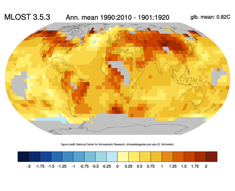
Change of annual mean temperatures between 1901:1920 and 1991:2010 based on the NOAA MLOST dataset. Credit: ClimateDataGuide, National Center for Atmospheric Research
Global warming might be a lot more fun if it came with a thermostat. Like most people in northern NY State, there are times when I wish it was not quite so chilly. If I could tweak some climate-dial so my tomato plants could safely go into the garden on May 1, guaranteed frost-free, it would be wonderful. And few of us would complain if we could suddenly grow peaches and oranges in our backyards.
But aside from a complete lack of control over the whole process, my main gripe about global warming is its first name. It’s just that hardly anyone besides astronauts has a decent grip on the massive size of the round lump of water and rock upon which we all live. Whenever there is a cold snap, a lot of us—me included sometimes—wish global warming would hurry the heck up and get on with it. And some of us even question whether weather is actually changing at all.
One of the issues is that no one looks at globes anymore. The next time you see a web-based or wall map, verify that it is flat. Unless you have a unique wrap-around computer screen, or an IMAX theater in your bedroom, chances are you’re staring at a rectangular, flat object. Ever wonder how cartographers turn a spherical object into a smooth planar representation? Yeah, me neither. I’m still not quite sure how it’s done.
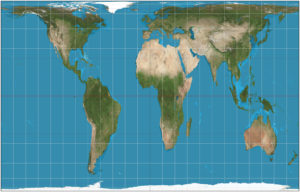
Mercator Projection. No, Greenland in not the size of Africa. Map: Strebe, Creative Commons, some rights reserved
The one thing I do know is that the flat image on our map is, by definition, distorted. If you don’t believe me, take a basketball, a pair of sharp scissors, and maybe a medium-hot iron, and try to make the basketball into a flat rectangle with no bulges or ragged edges. I’ll check up on you in a few weeks to see how you are coming along.
Surprise—our maps are all wrong. Sort of. I mean, people have been using them to get around for hundreds of years, so they are not completely useless. But in order to take a puffy round globe and mash it square and flat, some cheating is required.
Hopefully you can get your hands on an old globe at a flea market, dig one up from the attic or basement, or maybe pinch one from your kid’s classroom at the next parent-teacher conference night. Once you finally have the whole world in your hands, check out the longitude lines, the ones which run north-south. They are far apart near the equator but converge at the poles. Now go to your computer, smart phone or wall map, and notice that the same longitude lines are now magically square like a tic-tac-toe grid. Now go crack a cold beer or something, because trying to figure this out always gives me a headache.
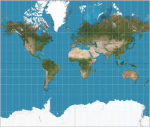
Gall–Peters Projection. Relative areas accurately portrayed. Map: Strebe, Creative Commons, some rights reserved
The map of the world we have used for generations is called the Mercator Projection, after the first guy to successfully iron out a globe. That is actually quite close to how he did it, by the way. It was the handiest method to git-er-done at the time, and we were all grateful the whole class could finally see all the countries at once without fighting over who got to spin the globe. Of course there was the minor issue of inaccuracy, but humanity is a busy lot, and it took a while before another model emerged. Today we have something called the Peters-Gall Projection, soon to be the world standard. It is highly accurate, but also a real shock the first time you see it.
Pictures used to be worth a thousand words, but the exchange rate fell off a cliff after cheap cameras and smart phones came on the scene. Still, a good picture is more powerful than quite a few words, and a bunch of numbers as well. Look at a Mercator projection of Greenland as compared to Africa—they look roughly the same size (if anything, Greenland looks bigger). An old Encyclopedia Britannica will tell you the same thing today’s Wikipedia will: Africa is 11,730,000,000 square miles, and Greenland is 836,300 square miles. This means almost nothing.
Until you look at the Gall-Peters map and see that Africa dominates the planet. It is more than 3 times the size of the United States, and nearly 15 times as big as Greenland. And good luck finding the latter—it looks like it shriveled up in the cold water and retreated into the North Pole.
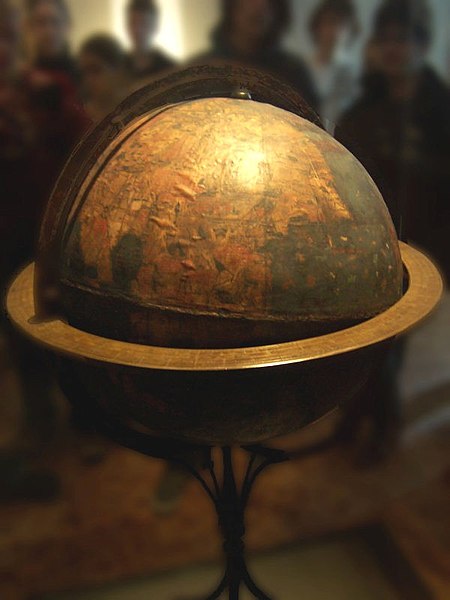
The “Erdapfel” of Martin Beheim is the oldest surviving terrestrial globe, made between 1491 and 1493; the Americas are not yet included. Photo: Germanischen Nationalmuseum, Creative Commons, some rights reserved
Being a ninth-generation American raised in western New York State, I had assumed the United States took up most of the world. It turns out that it only feels that way. Americans consume 24% of the world’s fossil fuels, (world mapped by fuel consumption) but we make up only 4.4% of the world’s population (world mapped by population). However, the really big deal is that the US comprises less than 2% of the surface of Plant Earth. So if a few of us in the northern states decide it’s too cold for our liking, and therefore the planet cannot possibly be heating up, we need to get a hold of ourselves. As odd as it may seem, other things are happening in the 98.1% of the globe that lies outside the 50 US States and territories.
We have but a puny taste of the Earth’s weather, and need to bear in mind that most of the world gets a different flavor from what we experience in our backyard. Our planet is heating up—temperature readings around the world are unequivocal, as well as unbiased (anyone who doubts the accuracy of thermometers should certainly not trust more complex scientific gadgetry like heart monitors, testing labs, or computers for that matter). So let’s try to find a more realistic perspective of how small we really are, and to behave accordingly.
Also, kindly return those globes when you’re done.
Paul Hetzler is a horticulture and natural resources educator with Cornell Cooperative Extension of St. Lawrence County.


Flat maps distort the farther north or south you go from the Equator.
Global temp maps are highly suspect.
Did you know you need an ice free Arctic Ocean to start an Ice Age?
I keep wishing for the next Ice Age and find hope in Global Warming.